At this weeks Illustration class we showed our work for the emergent reader.
The comments on my work were mixed.
The main one that I need to focus on to improve my art is that the backgrounds are interfering with the ability to see the characters.
It was recommended that I change the colors, remove some color and show "the white of the page", and or make the background colors flat/solid and not so washy.
With that in mind I have played around in Photoshop a bit to do some quick revisions...
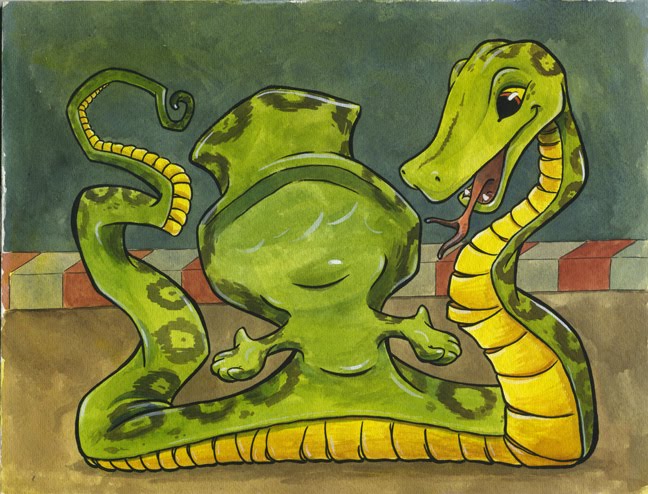
This is the original painting...
 This is with a solid lavender for the upper part and a solid brown for the bottom part without touching the middle red and white bit.
 This one has a solid blue top part, solid red and white stripe, and a solid brown bottom part.
 This one has a solid white upper part without touching anything else.
Let me know your opinion on the best way to proceed.
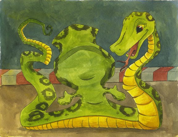
These are the "finished" pieces I showed in class...


