Friday, December 17, 2010

The day after Christmas

This is a work in progress.
It started out with this sketch from my sketchbook.


An old guy on a vespa because I was searching for a motorcycle image on the web for a client drawing and some vespa images came up.

This is where I am at so far...


Since it's winter and Xmas time I decided to portray the guy as Santa.
I didn't want to do Santa in his work clothes, he doesn't deliver toys on a vespa after all, so I put him in his street clothes.
Then I decided that he would be headed for a well deserved vacation, thus the Dec 26th calendar page and Miami sign.
I'm working on the background now.
You can see that I have some snow drifts back there.
I'm thinking that I'll have to add something in the far background to breakup the blue sky.
I might put his workshop back there.
I think I may add a trailer loaded with luggage being pulled behind the vespa to add to the going on vacation feel.
Let me know what you all think of the image so far.
I'm looking for comments on color, contrast, detail, does anything look "off," that kind of thing.

Saturday, November 20, 2010

Head games

Lately when I do art for myself it's with traditional media. Watercolor, gouache, pen and ink or pencil.
I like having a finished piece of art to look at and hold. It's a nice feeling of accomplishment.
Most of my client work ends up being digital, even if it starts out being drawn traditionally.
So I have been trying to figure out a "style" to call my own when doing digital art for myself that wil hopefully appeal to future clients.
With that in mind, I was flipping through my sketchbook yesterday and found a really rough sketch of a head. 
When it comes to digital work I prefer Illustrator over Photoshop. I like creating flat/graphic areas of color over trying to make the figure/object look 3 dimensional.
So I drew up the head in Illustrator and played around with variations of it.
Here it is...


The 4 on the left are just changes in facial features and their positions.
The others are the Base 1 head with variations of facial hair and accessories.
After doing the pirate guy my daughter wanted to see him with a beard so I came u with this version...


I like the way he's looking so I'll be figuring out what kind of body to give him and put him in a simple setting.
Next she wants  to see a girl pirate, so I'll post her in the future.

I just realized I need to change the color of his eyebrows to blue.
He's looking kind of like an elf with the big ears so I'll have to experiment with the idea of elfin pirates.

So if you ever find yourself stuck or bored when you are sketching, draw out several simple circles or ovals or whatever and just see what you can make out of them.
This is an experiment I recommend to everyone. It can stimulate your creativity and lead you to new ideas for your art.

Thursday, October 28, 2010

IF-Racing


Adobe Illustrator and Photoshop.
This guy was a work in progress that I grabbed and added a simple background to just for fun.
He was created in illustrator and then blurred in photoshop.
Can you see the Richard Scarey and "Go, Dog! Go! influence? I knew you could.

Thursday, October 14, 2010

Bobcat color

Here's the painted up Back Beat Betty.
This first version is straight watercolor and gouache.


This one was manipulated a bit with Photoshop.


I added two layers.
One filled with purple in the dark areas and set to multiply with a 70 percent opacity.
The other is a duplicate of the purple layer that I added noise to with the noise filter and then reduced the opacity to 50 percent.

It gives it a better feeling of her being in a spotlight up on stage.
I think I might have to go in and add her shadow that would be cast by the spotlight. Not sure about that though.

I also might go back in and add some more details to her to make her look more like a bobcat.
Notice she doesn't have any whiskers or any markings.
I have a good reference pick that I have been using for her so I'll go back to it and "plus" her up.

She's the first in a series that I want to do.
It's a series of Beatnic animals.
I have to get to the library and see if I can actually find any books on beatnics.
I'l also have to look up some musical phrases to be able to name the rest of the characters.
Some of the ideas for characters are a cat fish, yak, toucan, squirrel, mouse, sloth,...

Thursday, September 30, 2010

Beatnic Bobat


This is the line art for my next painting exercise.
The circle will be a yellow spot light.
The areas around the circle will have a purple under painting.
She's a bobcat beatnic beatin' on the bongos.

Monday, September 27, 2010

White Bird

The White Bird likes to wear Wigs.
It's not easy to paint an all white picture.
I can't do it. I know because I really tried with this one.
I like color. Kids like color. You like color.
So, the white bird has hints of color in her, and she has a nice red/orange wig.


I'm not sure the background is finished.
I'm considering putting a pattern on the wall.
Like this...


That pattern was added via photoshop.
I am purposely avoiding digital methods for these paintings so that the painted art is the same as the printed art in the book. So is I do a pattern it would either be simpler or have bigger elements in it.

This is the 3rd go at doing the White Bird.
The first one was this...


White Bird watches TV.
To me it's funny. But because he's asleep like a lot of dads who watch too many sports shows on Sunday.
I got comments about the "wife beater" shirt and all that's missing is the beer. So I rethought it.

The second one was going to be "White Bird goes for a walk."
It didn't get finished because I felt it was too boring.

After thinking about it. I felt that there needed to be another girl bird in the book, and she should make eye contact with the reader. Open eyes make the character more likable.

Now all I have to do is figure out the cover art.
I also need to figure out the type treatment or find a graphic designer who wants to do the layout for fun or his/her portfolio. I'm not asking, I'm just saying.

Friday, September 24, 2010

Inspiration from the past

I love my sketchbooks. I try to keep one handy at all times.
It took me a while to get used to it, but now I feel incomplete if I don't have one with me.
Did I say I love my sketchbooks? I do.
Because you never know what's really in them until you go back through an old one look at them with new eyes.
For example:
This is a page from one of my sketchbooks from last year.


As you can see I used the top part of the page to do a quick sketch of a Circus Train for the  Illustration Friday website. The word of the week was "Wind." It was supposed to be read as the wind that blows through your hair, but I read it as you have to wind something up to make it go.
  I liked it and had room so I used the bottom half to do a tighter version using pen and markers. Like I said, that was last year.

Yesterday I revisited this page and used it as inspiration to draw/paint this...
I had some scrap that was left over from another painting and I wanted to use it to do a small one day painting. 
His basic proportions and the pose are the same, but I drew/painted him in the way that I am currently working.
He was painted using gouache on watercolor board.
He started out like this...


At least that's how far I got before realizing I needed to scan him if I wanted to show the process.
At this stage I have drawn him in pencil on the board, used a brown Pitt Pen to do a tight line drawing, then erased the pencil drawing leaving the pen line, I then did the underpainting in a sepia and brown mix of gouache and watercolor. After that I started to add color. As you can see at this stage the nose is pretty much done.

He turned out nice so I think I'll use him as inspiration to do a set of paintings. Maybe they'll end as prints or I can license them to someone. Maybe the little circle can be personalized.

I love my sketchbooks!
My sketchbooks are full of drawings. Some good, some bad. That's just the way it goes.
So I say, go out get a sketchbook and start drawing in it. If you don't like the kind you bought, buy a different kind next time and draw in it. Keep doing it until you find a kind you like and buy them when they are on sale, so you have a new one when the old one gets filled up.
I f you do this you'll soon be saying, "I love my sketchbooks!" too.

Monday, September 20, 2010

Purple!

I just finished painting the purple bird for the book concept.
Here it is...


Purple Bird paints a picture of his pet platypus.

Friday, September 17, 2010

New bird art

Actually it's One new bird and One revised bird.

The new bird is the pink bird.
"The pink bird is a Princess who has found her Prince."


The revised bird is the yellow bird.
I revised the background color from this...


To this...


As alway comments and crits are always welcome.

I am currently working on the purple bird and will be revising the white bird.

Tuesday, August 17, 2010

Illustrator Art


One of the hazards of becoming a full-time Illustrator is that you find it hard to just sit down and draw for fun.
What I've noticed in the past couple of years is that whenever I sit down to draw the first thought that goes through my head is "How can I make money off of this?"
It can put a real damper on enjoying the act of sketching.
Especially when you're in a slow period.
When all you're thinking about is how to get more work so you can pay the bills.
I do my best to fight off the "Money making blues" the best I can when I open up my sketchbook so that I can let my brain wander and relieve some stress.
I draw whatever comes to mind and try to fill up the pages with as many images as I can.
Sometimes they lead to an idea for a project that I can use as an Illustrator.
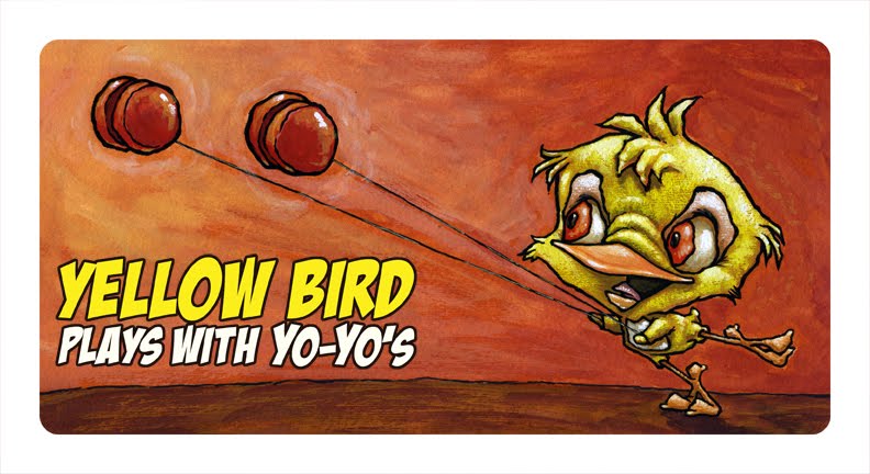
Like the image below.


I had been sketching birds in my sketchbook.
I often draw birds and bugs when I let my brain run free.
I guess it's due to a love of nature and a library full of books I read in school.
The image you see above originally started out as an idea for a simple animation for my church to show before services start. I decided to do it on my own and bring it in to show.
I haven't done the animation yet. I have to fire up my old G4 and open up my Flash program and learn how to use it properly.
I made a couple of animations way back when, but I never got the timing right.
So I'll have to spend some time experimenting.
While I was working out the bird characters I started liking the image as a moment in time and thought it would be good for a example of my digital art.
If you've followed this blog at all, you'll know that it's mostly traditional art that I post here.
I prefer to do my art traditionally lately because I spent 8 years doing mostly digital art and started missing being able to hold the finished piece in my hands and be proud of what I accomplished.
I do however still like being able to digital art.
I just like it to be kind of flat and graphic, not realistic.
So I decided to work this image up as a promo piece to send in an e-mail to prospective clients. Above.

One of the other habits you'll develop as a freelancer is that you will try to get as many uses as you can out of one image.
In this case the image will be used as the promo piece, the animation, and a mock-up of a book sample piece. Below.


As you can see, I cropped the image so that it would work as a two page spread.

So I have managed to take one image and figure out 3 ways to use it.
1. As an e-mail promo piece.
2. As a digital portfolio piece.
3. and as a animation.

I might even take these characters and work up a couple of more mock up book pages, or a simple story.

Thursday, August 5, 2010

Mermaid progression 8/05/10

It is progressing.
Here's where I'm at so far.


I started by painting the turtle. He's was looking pretty good, so I started on the mermaid.
She's looking good so far. 
Her hair going to be a challenge though.
I painted out the little sea horses in her hair. They might come back.
As you can see I haven't started the the single fish in the lower right or fish on the left yet.
I believe I'll start figuring out their "local colors" next.
They are going to be a bigger challenge than the hair.
I want to make sure I don't go color crazy.
I'm considering a rainbow effect.
Or maybe limiting them to 3 or 4 colors.
After I get everything mostly done, I'll go back and finish off the whole image.

Thursday, July 22, 2010

Mermaid progression 7/22/10

I just scanned this in so I can get started on the painting this girl.
This is the tight pencil on Crescent illustration board.


Right now I am planning on painting her as an Aboriginal Mermaid.
Dark skin and hair and white markings on her skin.
Her hair will be a dark reddish brown with some strong highlights.
I want her and the turtle to be the focal point so I believe everything else will get lighter as it gets farther away from them.
I had been planning on doing it the complete opposite way by painting the girl pale skinned with flowing red hair, but I like the aboriginal aspect for it's uniqueness.
If I was working smart I would print this out small on paper and do some color studies.
But, the original intention of this image was to experiment and have some fun, so I'm just going to "dive in"" and start painting.
I will search out some paintings by other artists of mermaids and give them a look for inspiration.

Tuesday, July 13, 2010

Water we do now?

I was able to get back to my mermaid art the other day.
I looked up some reference on the net for the sea turtle and various fishes.
I did some sketching in my sketch book of the reference materials and then put them away and drew the fishes so that they will have individual personalities. I don't think I'll be trying to depict specific species of fish. I'd like to just make them up and see what I end up with.
I'll go back to my reference for the markings on the turtle.
The mermaid is starting to look like she's going to be a "girl of color." Not your typical pale skinned mermaid. What color I don't just yet.
Here's where I'm at so far...
The basic idea is that she is ripping the net that is keeping the turtle and fish from having free access to the other side of the ocean. That ropy thing she is holding is the edge of the net. It's weave will make the left half of the painting darker than the right half. Her hair will fill the upper right corner of the page.
The bottom right corner will have a brain coral who's patterning will mimic the patterning of the net.
I don't have any idea what the color pallet will be yet.
I know there will be an overall color wash that will be built up to establish the modeling.
If you see anything that is glaringly wrong let me know.
I still have to figure of what kind of "top" the mermaid will be wearing.
As I am typing this I am thinking that I need to look up some reference of the indigenous peoples of Australia. She's starting to look like one of them to me.
I have transfered this to illustration board and I'm doing the tight pencils that will go under the under painting.
I'll show the tight pencil stage before I move on.

Saturday, June 26, 2010

One of the clients I work for owns  www.cartoonmaps.com
I do the art and layout for many of the maps.
One of those maps is for the Darke County Fair.
Each year they have a big musical act at the grandstands.
Each year I get to do cartoon versions of "The Band" for the map.
So far the acts have been REO Speedwagon & Styx.


Each year I put more effort into the characters because the map itself only needs some cosmetic changes to freshen it up. 
This years band is Lady Antebellum.

Below is how they will look on the map.


I enjoyed drawing them. I hope the band will actually get to see themselves.

Here are some of the characters that are wandering around the map this year.


Why a guy in a fish costume?
Why not?

Tuesday, June 22, 2010

Ribbit!

I haven't been able to post anything lately due to being busy with a day job and housework, but things have  started hopping again around here in the form of freelance work so I'll just have to start burning the candle at both ends again.
In the mean time here's a page from my sketchbook.

Frogs were just on my mind that day.
One of them may end up in a future book dummy.

Thursday, May 27, 2010

Board book art

Okay, I'm ready for some constructive criticism on what I have so far.
Here's the set up.
This art is for a combination self promo piece and book dummy.
The book is a children's board book for kids from birth to 6 years old. You know, the thick cardboard pages that the young 'uns like to chew on.
Each image is a 2 page spread. Each spread features a bird of a certain color. Red Bird, blue bird, green bird,...
There will be 10 spreads in all and a wrap around cover.
I wanted to keep the art simple without being simple flat colors. Not even clean colors.
Here's the art...
RED BIRD


ORANGE BIRD


YELLOW BIRD


GREEN BIRD


BLUE BIRD


PURPLE BIRD


PINK BIRD

Pink bird admires her Prince.

BROWN BIRD

Brown Bird bakes bread

BLACK BIRD


WHITE BIRD

WHITE BIRD alternative

Could also be WHITE BIRD Walks on windy Wednesdays

I don't have the wrap around cover art figured out yet.

In case you forgot by the time you made it all of the way down here, I'm looking for your thoughts on what's posted here. Think children's board book and let me hear what you have to say.
Depending on how this turns out I have some pages for an alphabet book roughed out already.
If any of you out there are graphic designers let me know what I could do to make the type treatment better.

Wednesday, May 19, 2010

Blue Bird

It's been a little while since I have posted anything.
I've been working a temp job that makes it hard to get anything done.
I have been working on my art though.
Like this.
It's one page of a board book concept. It's our basic color color book.
I'm in the process of painting the pages now. I have 7 done and 3 more to do, as well as some alternate pages to choose from.
This is the blue page.
The type is to make it clear what I'm doing. It will most likely change when I get feed back from the graphically inclined.
The finished size of the book is supposed to be 5" by 10" opened up. It will have rounded corners.
I'll be posting more of the art for feed back soon.

Monday, April 19, 2010

Something different

I have had to put my personal projects on hold lately due to taking a temp job during the day to make some steady income for a bit.
I am still freelancing as an illustrator. I have a couple of projects that I am working on at night.
That doesn't really leave me any time for anything else if I want to be able to sleep at night.
here's a partial peak at one of the freelance projects.
I can't tell you what it's for yet, but I can tell you that it's being created using Adobe Illustrator.
I'll be doing another one featuring a "lost in space" type of robot.


Monday, March 29, 2010

New rough concepts

I'm working on rough ideas for more portfolio pieces.
This one is pretty easy to read. It's a nice bright country scene of two boys fishing with their pet dog.
I the lower right corner will be a Kingfisher who has caught the first fish.
The background will be the lake and the shore with a simple fishing cabin.
I'm seeing a blue green lake, a dark brown-black tree and reflected light on the boys/dog.
As you can see I still need to take a good look at my dog reference to get his anatomy correct.
This one is my idea for the IF web site.
The word of the week is "rescue."
This is my mermaid rescuing a sea turtle from a fishing net.
I'm thinking a purple and yellow fantasy type of color scheme would be good here.
Her hair will fill up the top right corner of the image.
I wanted to do some simpler images as well, so I started drawing a character that filled most of one half of the page. I wanted to get a info page in science book feel.
This guy is holding up his peanut butter sandwich. The facts would be printed on the white part of the bread.
I'm not sure what she will be holding up yet.
Any suggestions?
I will be doing some paintings of characters standing on their own for practice/filler.
I believe I'll be doing a few more rough ides before I start painting any of them.
I would like to work up a night scene and probably a winter and rainy scene also.

Part of the reason for doing these illustrations is to solidify in my mind how I draw/paint people.
Another is to see if any of the people start to reoccur and become characters that I can show in multiple images.

Sunday, March 21, 2010

Status Report 3/21/10

It's Finished!
I worked into the wee hours of the night Friday night and got it most of the way done, and then did a little touch up here and there on Saturday morning and finished it up.
Here it is...


Here are some close up details..
The bird


The orange cat

and the dog


I'm happy with the way it turned out and am glad I tried out a new way of painting.
I now have a better understanding of why an underpainting is important.
I never understood why an artist would spend so much effort on an underpainting only to completely paint it over before. Now I do.
The extra step of a light coat of workable fixative over the underpainting was worth it also.
The fixative kept the water color from bleeding through the gouache.
You have to be careful not to put too much fixative on though. If you do the gouache will just puddle on the surface and not stick or cover well.

As a final step I sprayed a couple of coats of clear sealant over the image.
Gouache can pick up fingerprints and such very easily so I wanted to protect it.

I believe I will be revising my website so that this image will be the splash/home page.
The image that is up now was created digitally and I want to let visitors know that I am a traditional illustrator first and a digital illustrator second.
You can see my web site at ...
http://www.robertsnyderillustrates.com
to see what I mean.

I believe I'll be taking what I learned from this painting and revisiting my bird book ideas.
I have two ideas I want to work on. A Boardbook about colors and one about the alphabet.