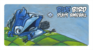
Here's the set up.
This art is for a combination self promo piece and book dummy.
The book is a children's board book for kids from birth to 6 years old. You know, the thick cardboard pages that the young 'uns like to chew on.
Each image is a 2 page spread. Each spread features a bird of a certain color. Red Bird, blue bird, green bird,...
There will be 10 spreads in all and a wrap around cover.
I wanted to keep the art simple without being simple flat colors. Not even clean colors.
Here's the art...
RED BIRD
ORANGE BIRD

YELLOW BIRD

GREEN BIRD

BLUE BIRD

PURPLE BIRD

PINK BIRD

Pink bird admires her Prince.
BROWN BIRD

Brown Bird bakes bread
BLACK BIRD

WHITE BIRD

WHITE BIRD alternative

Could also be WHITE BIRD Walks on windy Wednesdays
I don't have the wrap around cover art figured out yet.
In case you forgot by the time you made it all of the way down here, I'm looking for your thoughts on what's posted here. Think children's board book and let me hear what you have to say.
Depending on how this turns out I have some pages for an alphabet book roughed out already.
If any of you out there are graphic designers let me know what I could do to make the type treatment better.


