Here's the set up.
This art is for a combination self promo piece and book dummy.
The book is a children's board book for kids from birth to 6 years old. You know, the thick cardboard pages that the young 'uns like to chew on.
Each image is a 2 page spread. Each spread features a bird of a certain color. Red Bird, blue bird, green bird,...
There will be 10 spreads in all and a wrap around cover.
I wanted to keep the art simple without being simple flat colors. Not even clean colors.
Here's the art...
RED BIRD

ORANGE BIRD

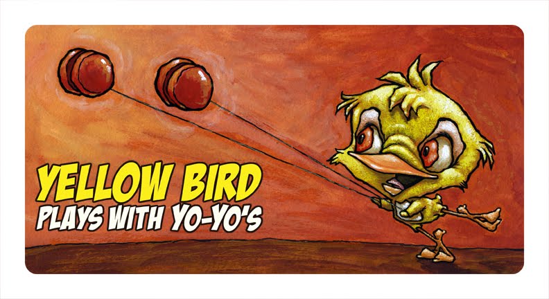
YELLOW BIRD
GREEN BIRD

BLUE BIRD

PURPLE BIRD

PINK BIRD

Pink bird admires her Prince.
BROWN BIRD

Brown Bird bakes bread
BLACK BIRD

WHITE BIRD

WHITE BIRD alternative

Could also be WHITE BIRD Walks on windy Wednesdays
I don't have the wrap around cover art figured out yet.
In case you forgot by the time you made it all of the way down here, I'm looking for your thoughts on what's posted here. Think children's board book and let me hear what you have to say.
Depending on how this turns out I have some pages for an alphabet book roughed out already.
If any of you out there are graphic designers let me know what I could do to make the type treatment better.


2 comments:
Hi Robert, I like the red, orange and blue birds best. Have you considered making the background the same colour as the bird for yellow and green? otherwise it could be a bit too much the same colour background throughout the book - different coloured BGs would make it a really fresh experience when you turn the page. Good luck!
Hey Robert!!!
For a board book I would think you would need to really drive the point home by having the dominant color on the page being the highlighted color. Orange Bird, Blue Bird, and Black Bird do this pretty well and therefore to me are the most successful. If Red Bird had the same color background as Yellow Bird that would work better too. In My Opinion of course. Though on a pure image basis Green is my favorite! I love those glasses!
Your font I think is an excited and exclamative (sp?)one. Using it throughout the text feels like everything is being yelled at you. Using it at key points in your script to emphasize certain words would work better I think. Maybe only using it for the color and the object being played with or used for the adjective being used to describe the item. "Green" bird has "New" glasses. Increasing the size for emphasis would potentially help as well!
I'd also add a sans-serif font to the fold. Something that can play the straight man to your funny man font. Help to give a visual cadence and rhythm to your words.
Also, it seems strange that some items get fuller descriptions than others. The Yo Yo is just a YoYo but the Glasses are New!! Some descriptive adjectives should be used with all the items I think. I also like that the Black Bird plays the Banjo in the Bayou. It paints a more complete visual picture for a child. Either way giving personality to not only the bird but also the object could go a long way!!
For me your compositions are spot on as always and your characters are great!! You have it a little but I would expand on varying their personalities some. Most of them are shiny, happy birdies. The other majority look kinda confused with the exceptions of Black who looks like he's been hittin' the moonshine and White who kinda looks like a blue collar, wife beater, bum. When he wakes up I expect him to yell out "Stella!!!!!" LOL! But I like that variance in personality.
All the birds situations don't have to be happy ones. This could add a lot of potential humor to your book as well. What if you kept the verbiage the same for Yellow Bird but your image was him tangled all up in the yo yos and being kinda suspended from the ceiling or walls somehow. I think children like that kind of thing and they would get the visual joke or funny.
Ok, now I'll shetup and see what you have to say. Hopefully I haven't completely misunderstood the purpose of your book. But I just gave my two cents. Hopefully it makes sense. If not let me know! Can't wait to hear what you have to say!!
-Wilson
Post a Comment